Grid Suggestion Menus
Grid Suggestion Menus appear when the user enters a trigger character, and text after the character is used to filter the menu items.
Grid Suggestion Menus are similar to regular Suggestion Menus, but results are organized in a grid, and users can use all arrow keys (including left, right) on their keyboard to navigate the results.
Emoji Picker
The Emoji Picker is a Grid Suggestion Menu that opens with the : character (or when selecting emoji item in the Slash Menu).
It only displays once the user types 2 non-whitespace characters a query, to minimize cases where the user only wants to enter the : character.
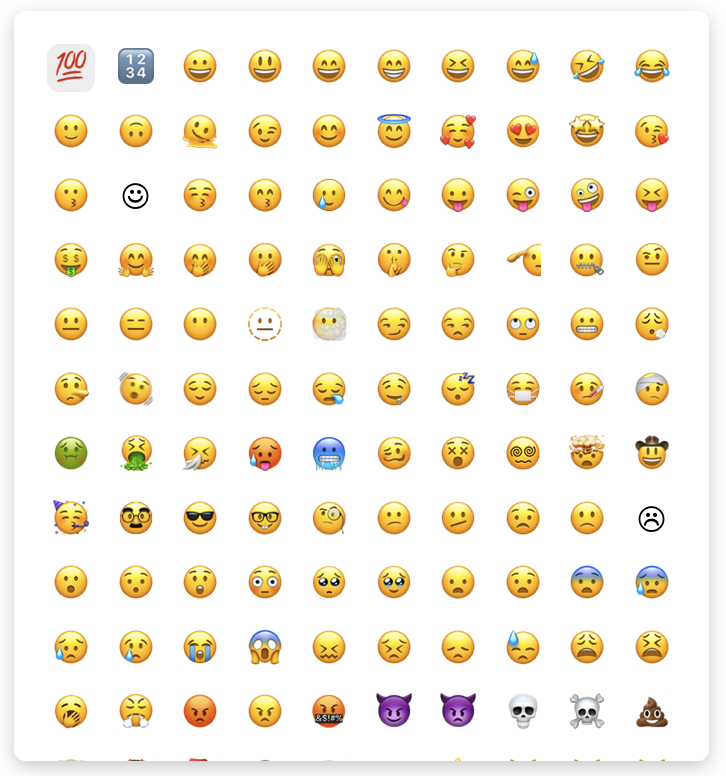
Changing Emoji Picker Columns
By default, the Emoji Picker is rendered with 10 columns, but you can change this to any amount. In the demo below, the Emoji Picker is changed to only display 5 columns.
import "@blocknote/core/fonts/inter.css";
import {
  GridSuggestionMenuController,
  useCreateBlockNote,
} from "@blocknote/react";
import { BlockNoteView } from "@blocknote/mantine";
import "@blocknote/mantine/style.css";

export default function App() {
  // Creates a new editor instance.
  const editor = useCreateBlockNote({
    initialContent: [
      {
        type: "paragraph",
        content: "Welcome to this demo!",
      },
      {
        type: "paragraph",
        content: "Press the ':' key to open the Emoji Picker",
      },
      {
        type: "paragraph",
        content: "There are now 5 columns instead of 10",
      },
      {
        type: "paragraph",
      },
    ],
  });

  // Renders the editor instance.
  return (
    <BlockNoteView editor={editor} emojiPicker={false}>
      <GridSuggestionMenuController
        triggerCharacter={":"}
        // Changes the Emoji Picker to only have 5 columns.
        columns={5}
        minQueryLength={2}
      />
    </BlockNoteView>
  );
}
Passing emojiPicker={false} to BlockNoteView tells BlockNote not to show the default Emoji Picker. Adding the GridSuggestionMenuController with triggerCharacter={":"} and columns={5} tells BlockNote to show one with 5 columns instead.
Replacing the Emoji Picker Component
You can replace the React component used for the Emoji Picker with your own, as you can see in the demo below.
import "@blocknote/core/fonts/inter.css";
import {
  DefaultReactGridSuggestionItem,
  GridSuggestionMenuController,
  GridSuggestionMenuProps,
  useCreateBlockNote,
} from "@blocknote/react";
import { BlockNoteView } from "@blocknote/mantine";
import "@blocknote/mantine/style.css";

import "./styles.css";

// Custom component to replace the default Emoji Picker.
function CustomEmojiPicker(
  props: GridSuggestionMenuProps<DefaultReactGridSuggestionItem>
) {
  return (
    <div
      className={"emoji-picker"}
      style={
        { gridTemplateColumns: `repeat(${props.columns || 1}, 1fr)` } as any
      }>
      {props.items.map((item, index) => (
        <div
          className={`emoji-picker-item${
            props.selectedIndex === index ? " selected" : ""
          }`}
          onClick={() => {
            props.onItemClick?.(item);
          }}>
          {item.icon}
        </div>
      ))}
    </div>
  );
}

export default function App() {
  // Creates a new editor instance.
  const editor = useCreateBlockNote({
    initialContent: [
      {
        type: "paragraph",
        content: "Welcome to this demo!",
      },
      {
        type: "paragraph",
        content: "Press the ':' key to open the Emoji Picker",
      },
      {
        type: "paragraph",
        content: "It's been replaced with a custom component",
      },
      {
        type: "paragraph",
      },
    ],
  });

  // Renders the editor instance.
  return (
    <BlockNoteView editor={editor} emojiPicker={false}>
      <GridSuggestionMenuController
        triggerCharacter={":"}
        gridSuggestionMenuComponent={CustomEmojiPicker}
        columns={10}
        minQueryLength={2}
      />
    </BlockNoteView>
  );
}
Again, we add a GridSuggestionMenuController component with triggerCharacter={":"} and set emojiPicker={false} to replace the default Emoji Picker.
Now, we also pass a component to its gridSuggestionMenuComponent prop. The gridSuggestionMenuComponent we pass is responsible for rendering the filtered items. The GridSuggestionMenuController controls its position and visibility (below the trigger character), and it also determines which items should be shown. Since we don't specify which items to show (the getItems prop isn't defined), it will use the default items for a grid, which are the emojis.
Creating additional Grid Suggestion Menus
You can add additional Grid Suggestion Menus to the editor, which can use any trigger character. The demo below adds an example Grid Suggestion Menu for mentions, where each item is the first character of the user's name, and opens with the @ character.
import {
  BlockNoteSchema,
  defaultInlineContentSpecs,
  filterSuggestionItems,
} from "@blocknote/core";
import "@blocknote/core/fonts/inter.css";
import { BlockNoteView } from "@blocknote/mantine";
import "@blocknote/mantine/style.css";
import {
  DefaultReactGridSuggestionItem,
  GridSuggestionMenuController,
  useCreateBlockNote,
} from "@blocknote/react";

import { Mention } from "./Mention";

// Our schema with inline content specs, which contain the configs and
// implementations for inline content  that we want our editor to use.
const schema = BlockNoteSchema.create({
  inlineContentSpecs: {
    // Adds all default inline content.
    ...defaultInlineContentSpecs,
    // Adds the mention tag.
    mention: Mention,
  },
});

// Function which gets all users for the mentions menu.
const getMentionMenuItems = (
  editor: typeof schema.BlockNoteEditor
): DefaultReactGridSuggestionItem[] => {
  const users = ["Steve", "Bob", "Joe", "Mike"];

  return users.map((user) => ({
    id: user,
    onItemClick: () => {
      editor.insertInlineContent([
        {
          type: "mention",
          props: {
            user,
          },
        },
        " ", // add a space after the mention
      ]);
    },
    icon: <p>{user.substring(0, 1)}</p>,
  }));
};

export function App() {
  const editor = useCreateBlockNote({
    schema,
    initialContent: [
      {
        type: "paragraph",
        content: "Welcome to this demo!",
      },
      {
        type: "paragraph",
        content: [
          {
            type: "mention",
            props: {
              user: "Steve",
            },
          },
          {
            type: "text",
            text: " <- This is an example mention",
            styles: {},
          },
        ],
      },
      {
        type: "paragraph",
        content: "Press the '@' key to open the mentions menu and add another",
      },
      {
        type: "paragraph",
      },
    ],
  });

  return (
    <BlockNoteView editor={editor}>
      {/* Adds a mentions menu which opens with the "@" key */}
      <GridSuggestionMenuController
        triggerCharacter={"@"}
        getItems={async (query) =>
          // Gets the mentions menu items
          // TODO: Fix map/type cast
          filterSuggestionItems(
            getMentionMenuItems(editor).map((item) => ({
              ...item,
              title: item.id,
            })),
            query
          ) as DefaultReactGridSuggestionItem[]
        }
        columns={2}
        minQueryLength={2}
      />
    </BlockNoteView>
  );
}

export default App;
Changing the column count in the new Grid Suggestion Menu, or the component used to render it, is done the same way as for the Emoji Picker. For more information about how the mentions elements work, see Custom Inline Content.